|
|
Matching color, texture, and sheen is often the most challenging part of restoration. This lesson helps clarify the process
To achieve a seamless and nearly invisible repair, the color and surface sheen must match as closely as possible. One challenge is that colors can shift as they dry and may change again once a cold glaze or protective coating is applied. These variables must be anticipated during the paint-mixing process, as they can darken or lighten the tone or even alter the hue itself.
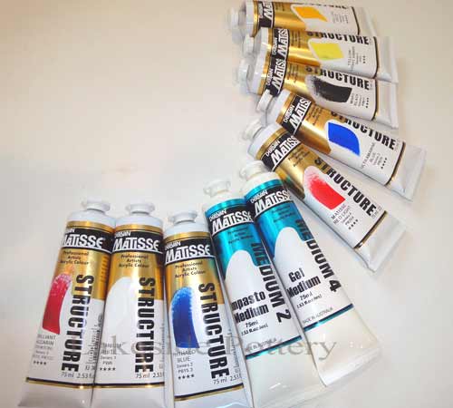
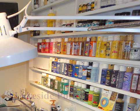
We primarily use acrylic paints, though depending on the project, we may also work with oil paints, mineral pigments, or dyes. For first-time DIY restorers, water-based acrylics are usually the best starting point because of their ease of use, flexibility, and forgiving nature.
Professional studio note: This lesson is based on the hands-on ceramic, pottery, porcelain, and sculpture restoration work performed at Lakeside Pottery Studio. Successfully matching a repaired surface involves far more than color alone. Professional restoration must also account for surface preparation, optical layering, texture recreation, and the final sheen to achieve a convincing result.
Related lessons: See our complete ceramic repair lesson, principles of seamless repair, and cold glaze guide.
A detailed explanation of advanced color-matching theory is available in appendix 1 below
|
Repair Example from Broken to Seamless
How to Mix Color: Basic Theory
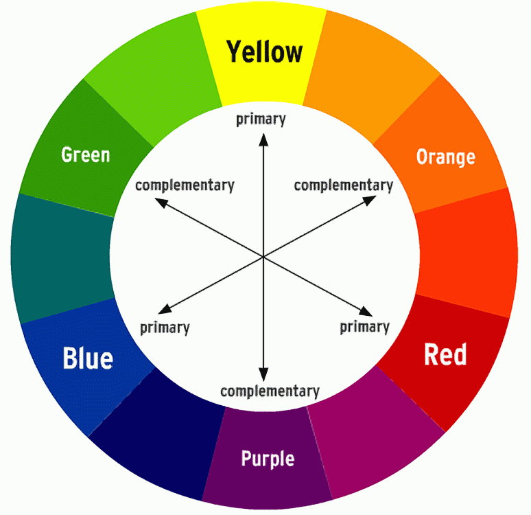
Any color can be created using a core palette of nine colors: the three primaries, blue, red, and yellow; the three secondaries, green, orange, and purple; plus white, black, and ocher.
Understanding these basics is important when starting to paint repaired ceramics or sculptures. If you already have painting experience, you may skip this section. While reading theory is useful, hands-on practice with actual color mixing is essential to developing skill.
A solid grasp of the color wheel helps guide this process:
- Primary colors (blue, red, yellow): These cannot be mixed from other colors
- Secondary colors (orange, violet, green): These are made by combining two primary colors. For example, mixing yellow and red creates orange.
These six colors form the foundation of the color wheel.
However, this is where theory and practice diverge. The color wheel is a helpful tool for understanding relationships between colors, but it isn't a reliable guide when selecting paints for repair work. The real-world variations in pigments and how they behave are far more complex than the wheel suggests.
For example:
- Cadmium Red leans toward orange (a yellow bias)
- Alizarin Crimson leans toward purple (a blue bias)
So, buying a "pure red" or a "pure yellow" is a myth, they don't really exist in practice.
Developing your Artist's Eye
Developing your artist's eye takes time. While a few people have a natural instinct for color, most need practice, so be patient with yourself. In the beginning, you might feel confident that you've mixed the perfect color. But once it's applied next to surrounding colors, or the original you're trying to match, it can suddenly look completely wrong. That's normal. The only way to train your eyes and brain to recognize subtle shifts in hue, value, and saturation is through trial and error. Over time, with repeated attempts, you'll begin to see what's missing, whether it needs a touch more blue, warmth, or brightness. It's a skill built slowly, but it does come.
What is Hue?
Hue is the simplest aspect of color to understand. At its most basic, it's an art term that refers to the actual color of a pigment or object, such as red, blue, or yellow.
What is Value?
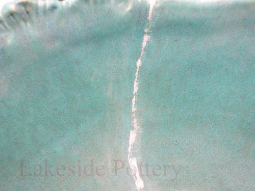
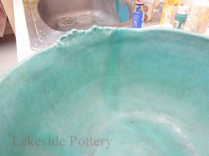
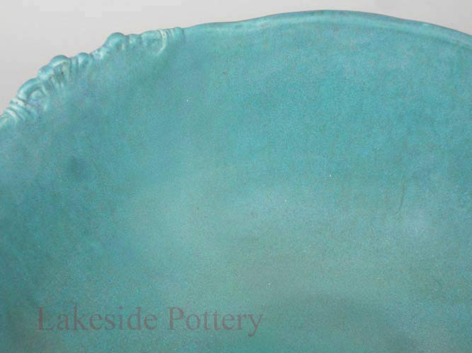
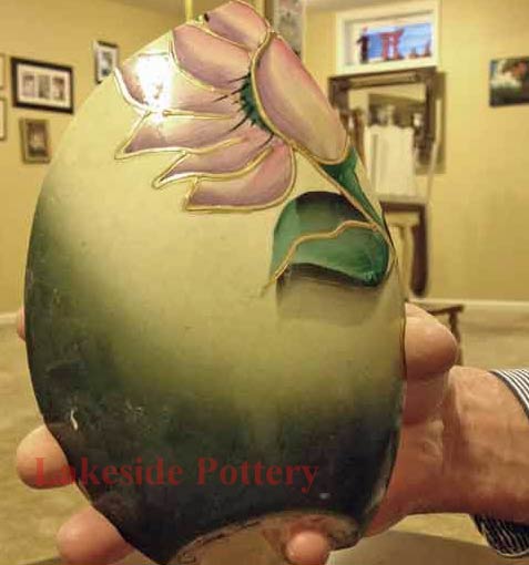
Value, also called tone, refers to how light or dark a color is, regardless of its hue. It's an essential part of color mixing and matching in restoration. One challenge with value is that our perception of it is heavily influenced by surrounding colors. A color that seems light in one context can appear much darker when placed next to even lighter tones, and vice versa. (See image on right.). Understanding and controlling value is key to achieving realistic and seamless repairs.
What is Chroma?
Chroma, also called saturation or intensity, measures how vivid or pure a color appears. Think of it as the difference between a bright, undiluted color and one that has been muted by adding white, black, gray, or by thinning it with glaze. You can adjust a color's chroma by adding neutral gray of the same value (lightness) as the color you're trying to modify. This lets you reduce the intensity without shifting the value or hue too drastically.
Aren't Value and Chroma the Same Thing?
Color mixing would be much easier if they were, but they're not. Chroma refers to how pure or intense a hue is, while value refers only to how light or dark a color appears, regardless of its hue. In other words, value ignores the color itself, focusing only on its brightness or darkness, whereas chroma is all about the richness or dullness of the color.
Do I Need to Consider Hue, Value, and Chroma Every Time I Mix a Color?
As a beginner painter, the answer is yes. It's important to consciously evaluate the hue, value, and chroma of the color you want to match before mixing. Taking the time to make a judgment on each aspect helps reduce wasted paint and frustration. The good news is that with experience, this becomes less of a deliberate, systematic process and more intuitive. Over time, you'll develop a natural sense of these elements and mix colors more quickly and accurately.
How to Match a Color?
When you first start, it's advisable to take your time to understand each step.
Step 1: Analyze the hue, identify which color on the color wheel it's closest to.
Step 2: Analyze the value, determine how light or dark the color is.
Step 3: Analyze the saturation (chroma), assess how bright or dull the color appears.
Some Color Recipe Examples
Blue Green: 1 part yellow, 3 parts blue
Blue Violet: 2 parts blue, 1 part red
Brown: 1 part yellow, 1 part red, 1 part blue
Charcoal: 2 parts blue, 1 part red, 1 part yellow
Citron: 1 part orange, 1 part green
Flesh: Start with white and add yellow, red, brown, and sometimes blue. Note: Flesh is the hardest color to describe (as you might imagine), so experiment with the ratios.
Green: 1 part yellow, 1 part blue
Olive: 1 part green, 1 part violet
Orange: 1 part red, 1 part yellow
Pink: 1 part red, 1 part white
Red Orange: 2 parts red, 1 part yellow
Red Violet: 2 parts red, 1 part blue
Russet: 1 part orange, 1 part violet
Violet: 2 parts blue, 1 part red
Yellow Green: 2 parts yellow, 1 part blue
Yellow Orange: 2 parts yellow, 1 part red
White makes any shade lighter, while the opposite color on the color wheel will darken it.
Important: Artificial light always leads to inaccuracy in color matching, so use natural light whenever possible.
|
Color wheel
Oil paints
Acrylic paints
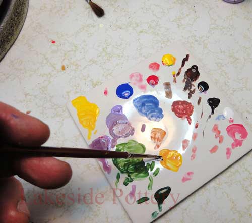
Mixing colors

Spraying with airbrush

Values
Example
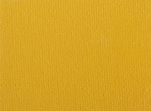
Target color
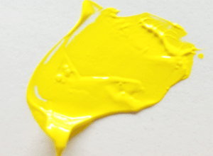
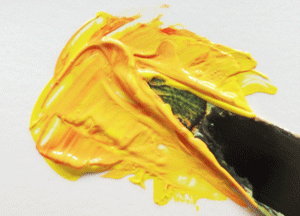
Starting with yellow
Adding colors
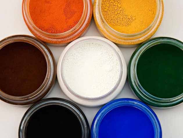
Mineral pigments
Cold glaze, non-yellowing - to Purchase
|
|
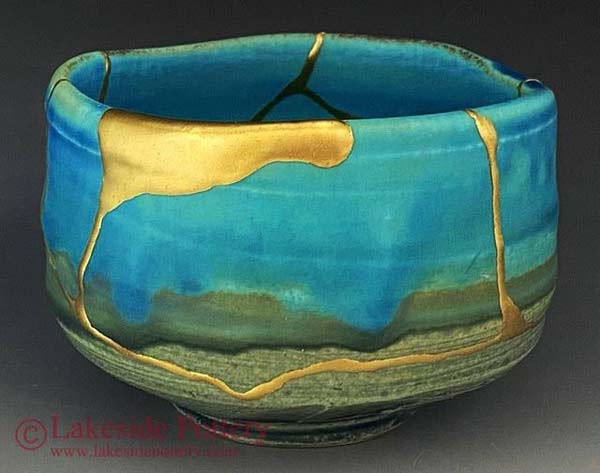
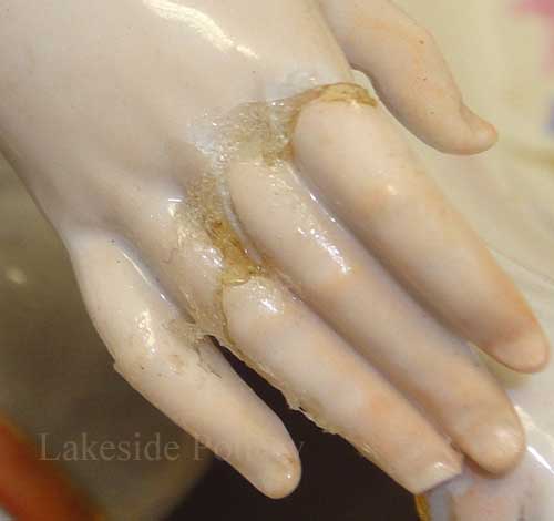
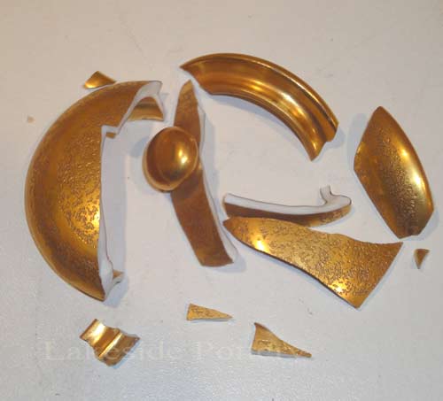
Why Painted Gold in Ceramic Repair & Restoration Cannot Match Precisely Kiln Fired Gold
Seamless restoration of pottery with gold-glazed details is one of the greatest challenges for conservators. When repairs are required, restorers apply cold gold paints to the repaired areas in an effort to restore the original gold details. While skilled application can achieve a close match in color and sheen, painted gold can never fully replicate the brilliance of kiln-fired gilding made with gold chloride. To understand the challeges and how Lakeside Pottery Studio handle painting gold details, visit the link below:
|
|
|
Using cold glaze effectively involves preparation, attention to detail, and understanding key variables. Here's a comprehensive guide to help you achieve a flawless and durable finish (click photo below).
|
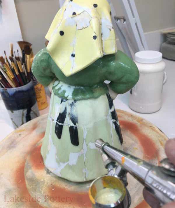
Air Brush or brushes?
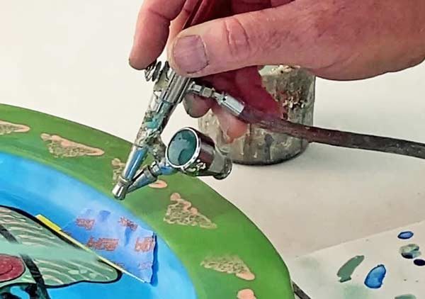
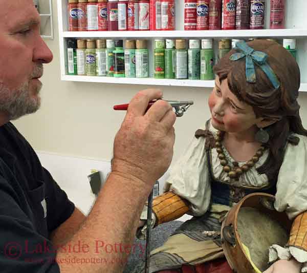
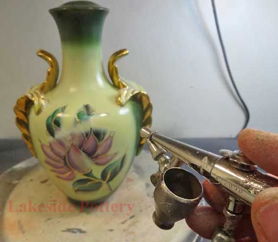
For general background colors and surface painting, we use an airbrush. Regular brushes cannot achieve the fine and/or translucent coatings without leaving brush marks that an airbrush can avoid. The gradual tapering of paint thickness, blending seamlessly into non-restored areas, is superb with airbrushing. We use the Paasche H-SET Series Single-Action airbrush system for this purpose.
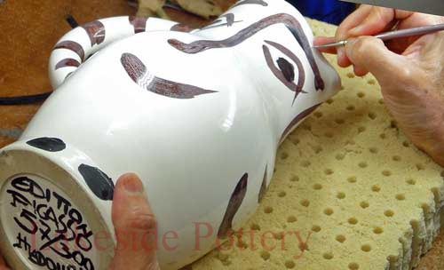
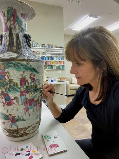
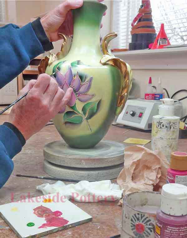
Brushes, however, are essential for duplicating original painted designs on repaired areas. Choosing the right brush is crucial to meet the quality standards necessary for retouching. To achieve an invisible repair, the original artist's brush type and stroke movement must be carefully replicated. (See Appendix 2 below for more about brushes.)
In restoration, brushes are primarily used for retouching. When evaluating brushes for this purpose, consider four factors: texture, origin, size, and shape of fibers. These influence properties such as filament retention, shape maintenance, tip precision, flow control, paint pickup, and steady paint release.
Key Factors in Airbrushing
Proper airbrush technique depends on:
- Dilution (e.g., thinning acrylic paints with water, see more on thinning acrylics for airbrushing)
- Operating air pressure
- Amount of paint released
- Distance from the surface
- Hand movement
- Paint thickness and nozzle size
For fine lines, hold the airbrush as close as possible to the surface, releasing a small amount of paint. For broader coverage, hold the airbrush 4" to 6" from the surface and increase the paint volume.
Managing Overspray
Airbrushing creates overspray, a fuzzy halo of tiny dots beyond the targeted area. To achieve sharp edges, use masking media such as low-tack masking tape, spray shields, or latex paint as a protective barrier.
Other Airbrush Tips
- Always test spray on scrap surface before applying to your work piece
- Thin paint gradually, too thin causes runs, too thick clogs nozzle
- Use gentle, steady hand movements to avoid uneven coats
- Clean your airbrush regularly to maintain consistent spray quality
|
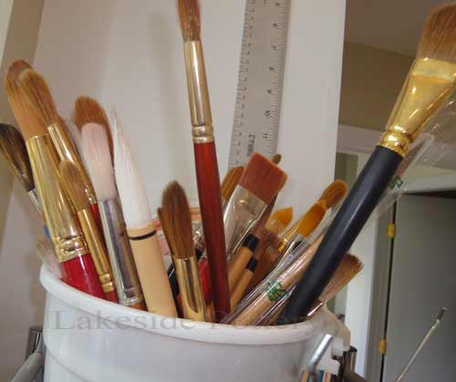
Brushes
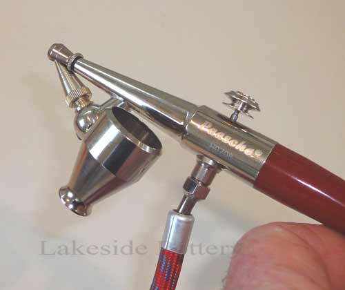
Airbrush - Paasche H-SET Series Single-Action

Compressor
|
|
|
|
Air brushing complex colors range
|
|
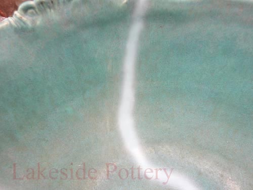
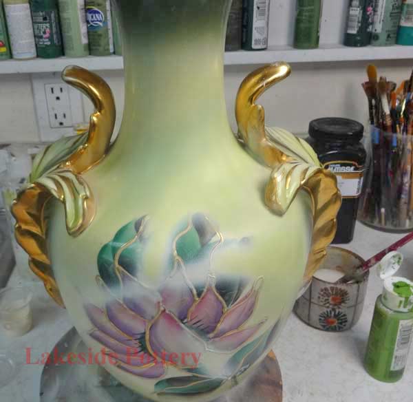
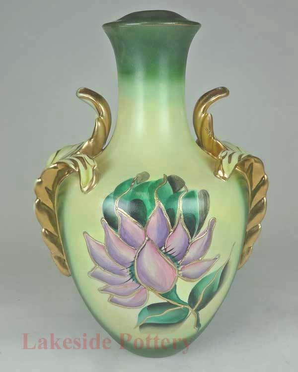
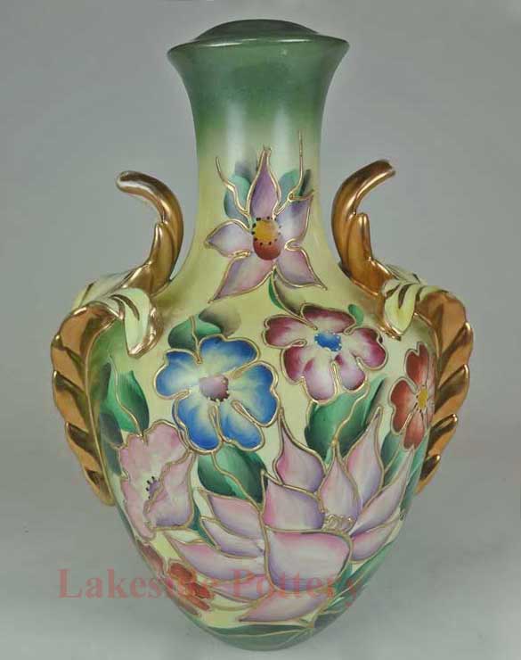
Bowl surface with repair line ready for painting
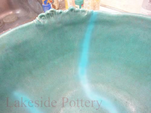
Clay color airbrushed over repair line
Turquoise elements painted with airbrush
Green elements painted with airbrush
Gray elements painted with airbrush
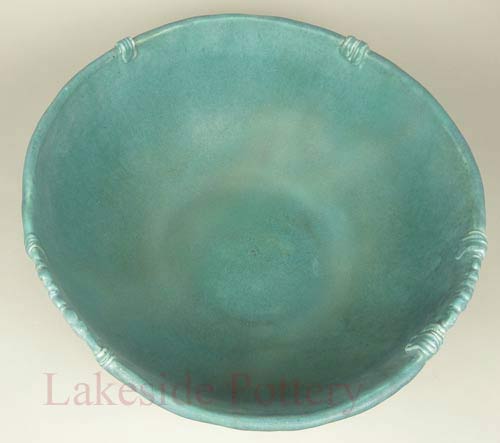
Repaired areas after matte cold glaze - ready!
|
|
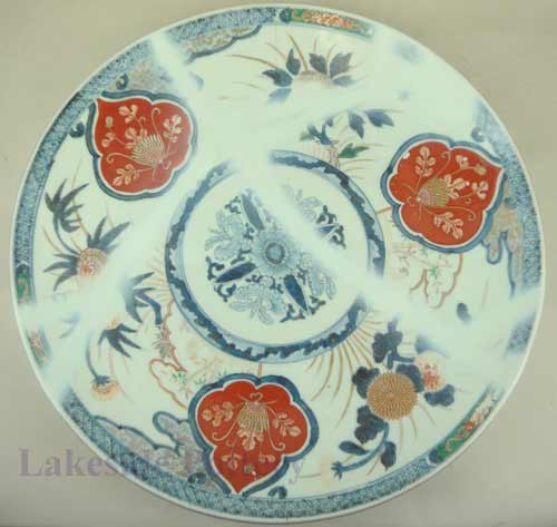
Imari Platter Repair Steps
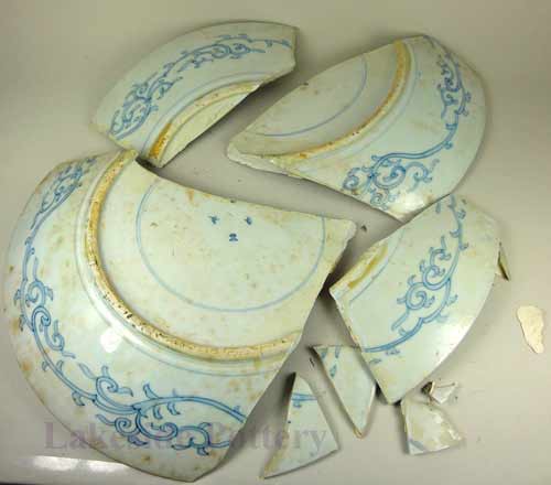
Imari platter- broken
Clay color sprayed - front
Clay color sprayed - front
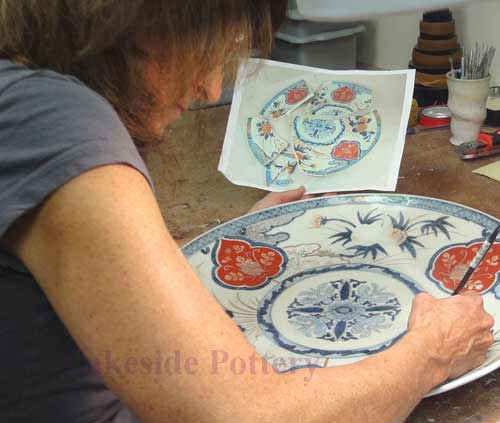
Details painted

Glaze matched and sprayed

All finished
Painting missing details
Air brushing a statue
|
Hiding Break Lines With Painted Details
|
Broken ceramic lamp
|
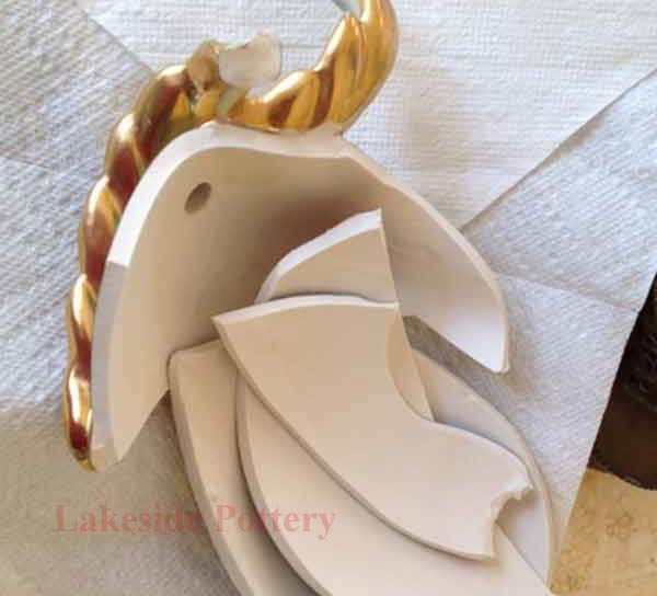
11 broken segments
|
|
Repair lines visible after cementing
|
Repair are missing more details after insuring smooth and continuous surface
|
|

Clean surfaces, protect undamaged paintings with latex and air brush clay color to hide worked areas. Cure at 160 degrees.
|
Airbrush background colors and shades of colors (4-6 layers). Cure at 160 degrees.
|
|
Hand paint all missing details including gold. Cure at 160 degrees and apply cold glaze with the proper matching sheen
|
Remove protective latex - pull at 90 degrees angle to insure fresh paint does not pull
|
|
Air brush glaze with slight texture to insure proper bond of the next hand painting step. Cure at 160 degrees for 36 hours.
|
Lamp complete
|
Lamp complete - ready for assembly
|
|
Appendix 1:Advanced Color Matching in Ceramic Restoration
Why Color Matching in Ceramic Restoration Is So Difficult
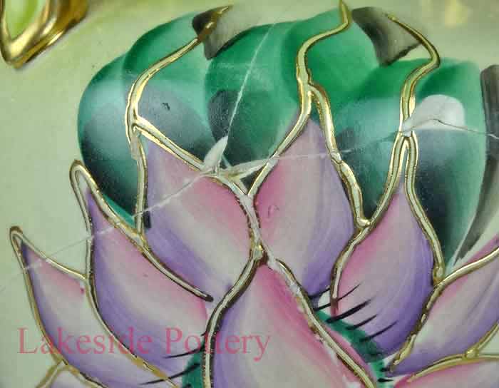
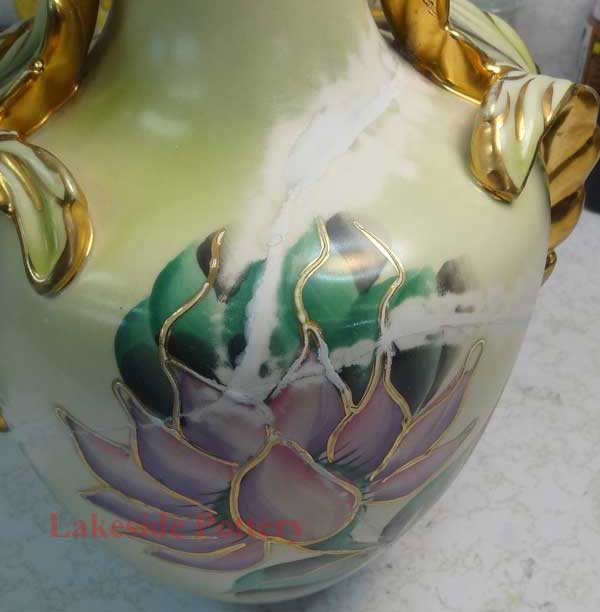
Color in ceramics is never a single flat layer. Fired pottery and porcelain surfaces are composed of several optical layers working together: the clay body, slips or underglazes, decorative elements, and a transparent or semi-transparent glaze.
Light travels through these layers, reflects off the ceramic body, and then returns through the glaze before reaching the eye. Because of this optical depth, a single layer of modern paint almost never matches a fired glaze, even when the pigment appears correct on the palette.
To simulate what the kiln created, restorers usually reconstruct the surface in a sequence of layers:
- A controlled base color that imitates the clay or ground tone
- Thin tinted layers to reproduce stains, speckles, or subtle glaze variations
- A final cold glaze layer that restores the original sheen and visual depth
Accurate matches come from building a layered system, not from one perfect mixture. Understanding this optical structure is essential for professional restoration.
Seeing Color as Layers Rather Than a Single Tone
Many students and interns struggle because they approach color as though it were one uniform surface. In reality, what appears to be a single color is a stack of visual information:
- The clay body beneath
- Underglaze tints, washes, or stains
- Painted decoration
- The final glaze sheen
Asking "What is the base, what is added on top of it, and how does the sheen change what I see?" leads to far more accurate results. This shift in thinking is often the breakthrough moment for developing reliable color matching skills. exercises help develop sensitivity to hue, value, and chroma:
- Match only the base tone of a chipped area before attempting decoration
- Create a value scale of the hue you are matching and compare under natural light
- Photograph test patches on a neutral gray background to evaluate accuracy
- Build color matches using thin layers rather than one heavy coat, studying how each layer changes the result
These exercises train the visual system to recognize the subtle differences that define professional-level matching.
Metamerism: Why a Perfect Match Changes in Different Light
A match that appears perfect in the studio can shift noticeably in another environment. This effect, known as metamerism, occurs because kiln-fired glazes and modern paints respond differently to warm incandescent bulbs, cool LED lighting, and natural daylight.
You can reduce surprises by:
- Checking matches in both natural and indoor lighting conditions
- Avoiding strong-colored surroundings when judging color
- Reviewing test patches in neutral-light photographs for a more objective comparison
Metamerism cannot be eliminated completely, but understanding it and testing colors across lighting environments brings your results much closer to what the owner will ultimately see.
|
Appendix 2: More About Brushes
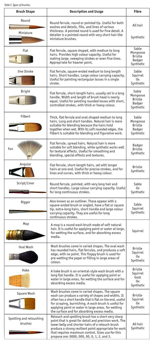
|
|